Case study
Roryn
Client
Hannah Grinsted
Services
Rebrand, visual identity, icon creation, brand illustration, presentation templates and LinkedIn assets
Collaboration
Charlotte Young and Hannah Dossary

Overview
Hannah Grinsted approached me to work on her branding, and from the get go I could tell it was going to be a bold and exciting project.
The project consisted of an initial brand audit where I assessed all of the existing assets and made suggestions on where improvements could be made. The Roryn branding had solid foundations, so the project was all about building on that, and making it more professional in it execution.
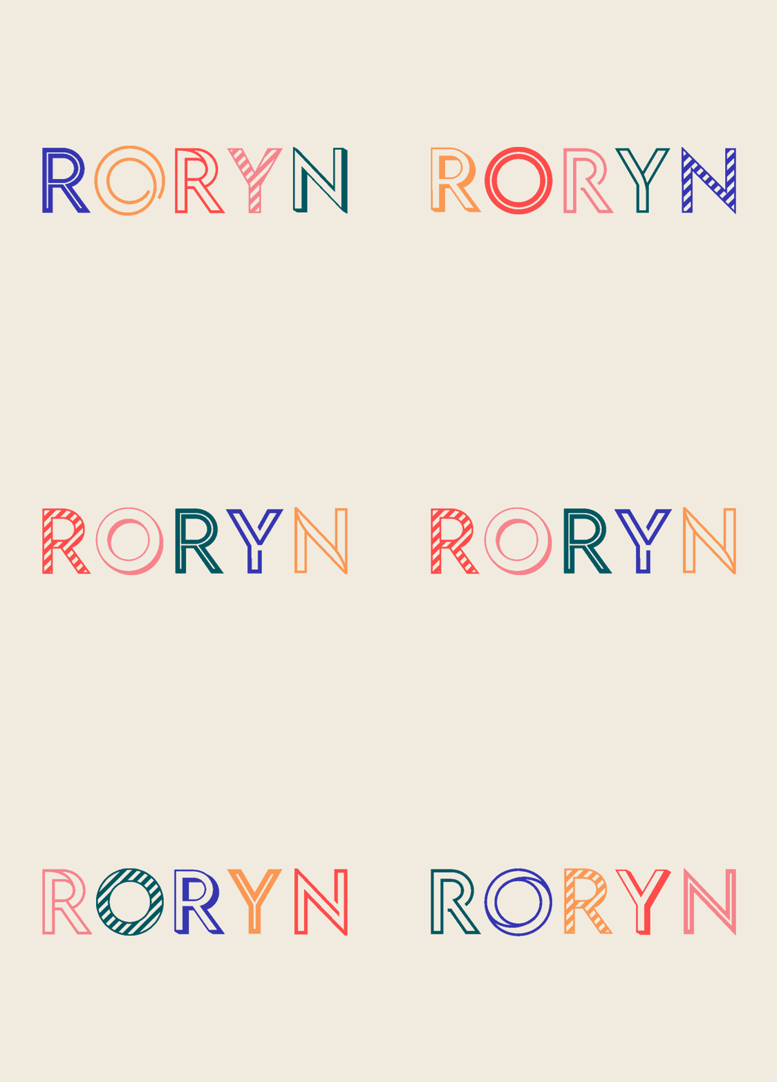
The development of the brand including an upgrade to the logo (along with an animated ident), streamlining the fonts and colours, creating design embellishments, icons and illustrations that were based on the company values.


Brand application
On completion of the logo and supporting visual identity, I created a brand style tile for Hannah, so that she had clear reference of how to use the assets going forward.
The styling was applied to branded presentation templates in Powerpoint, where the icons and illustrations were used to help bring the slides to life.
The branding was then applied to the Roryn website (another Hannah Dossary build), where the design was built on from the existing aesthetic. I had created an accessibility guide for the brand colour palette so that the new designs could be executed in the most user friendly way, something that was very important to Hannah.


The result
The evolved branding needed to reflect Hannah's company's values - championing women and being clear in everything that she puts out. But professional and sleek doesn't need to be boring, and so I dialled up the boldness and fun in the designs to compliment Hannah's personality, whilst executing the use of the designs in an elegant and considered way.
Working on multiple designed elements for Roryn meant that Hannah could be confident in her brand continuity across all her design elements.


